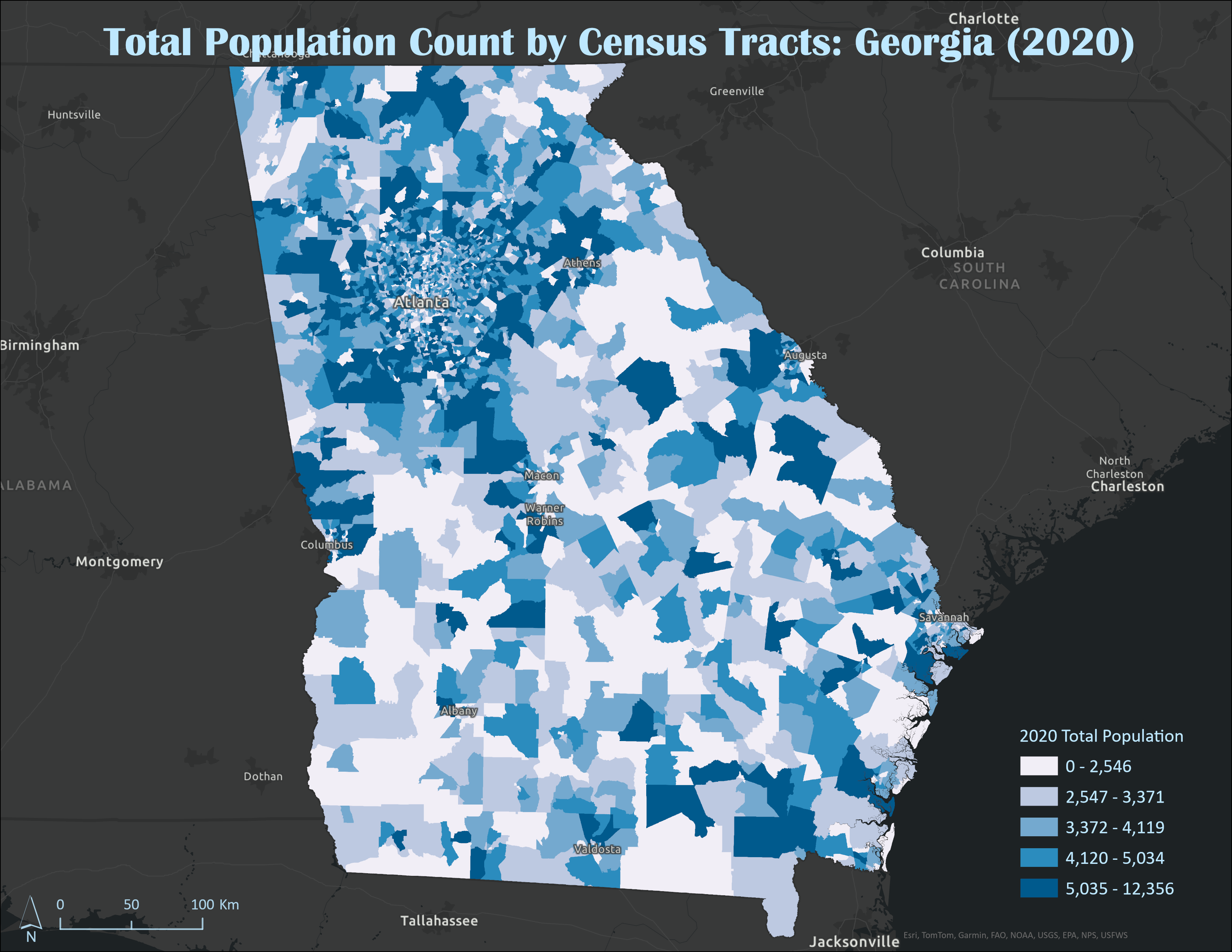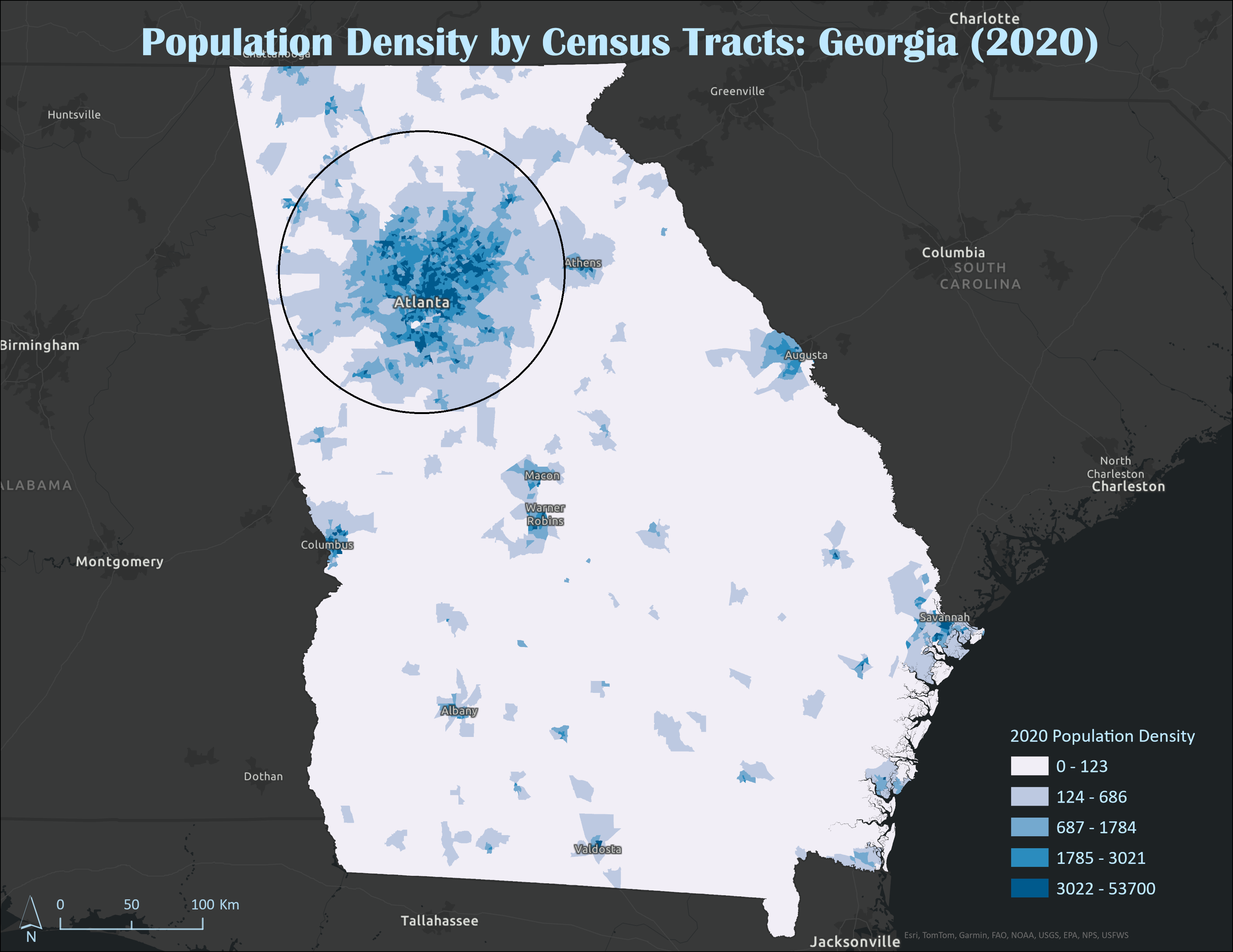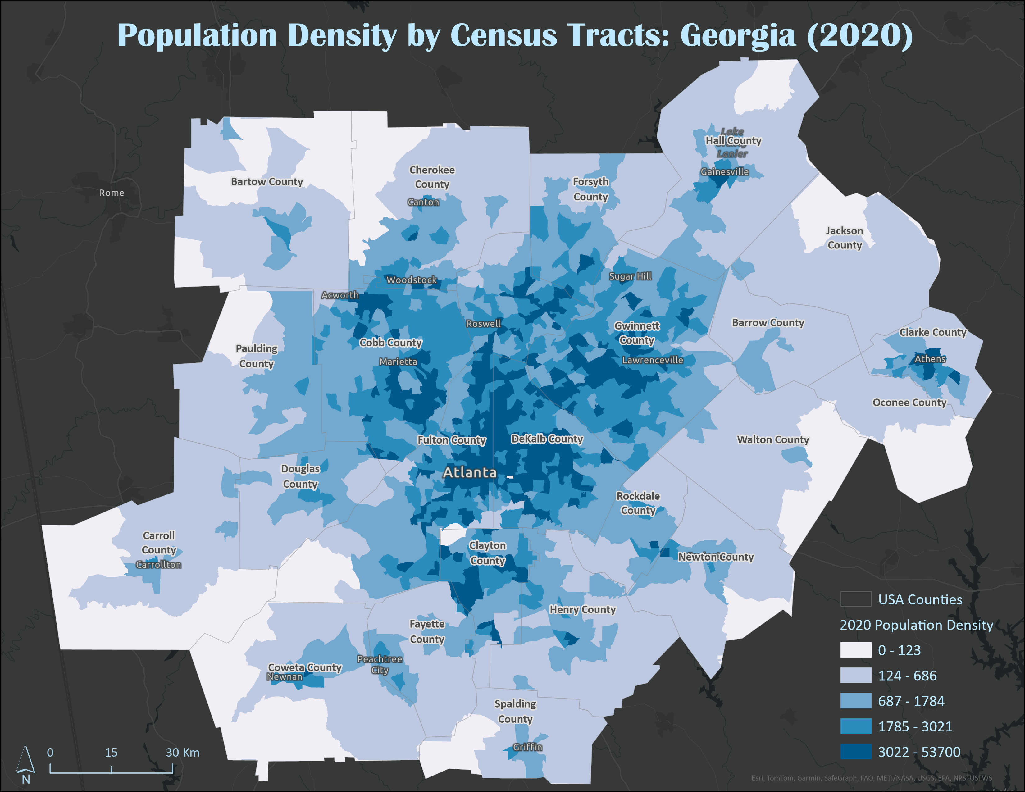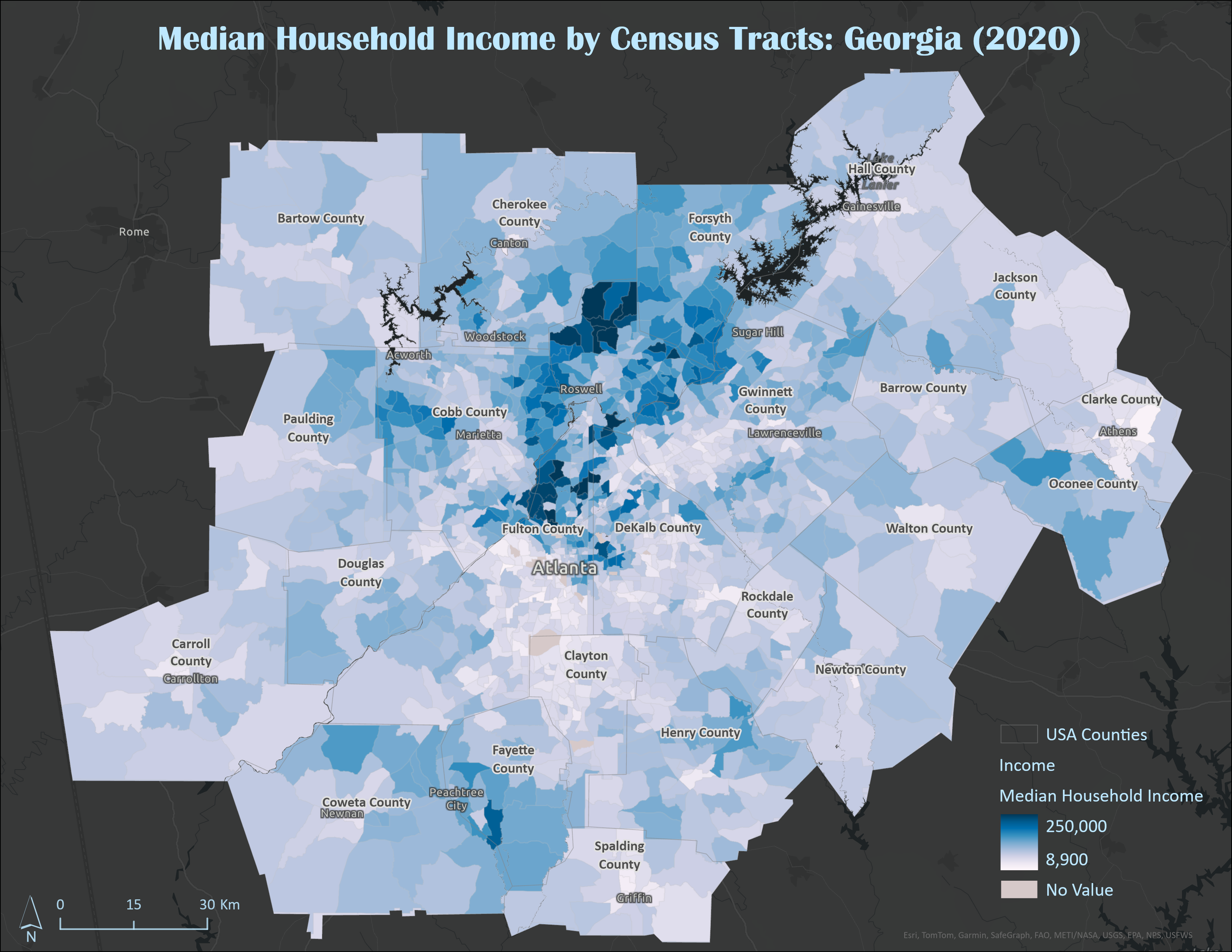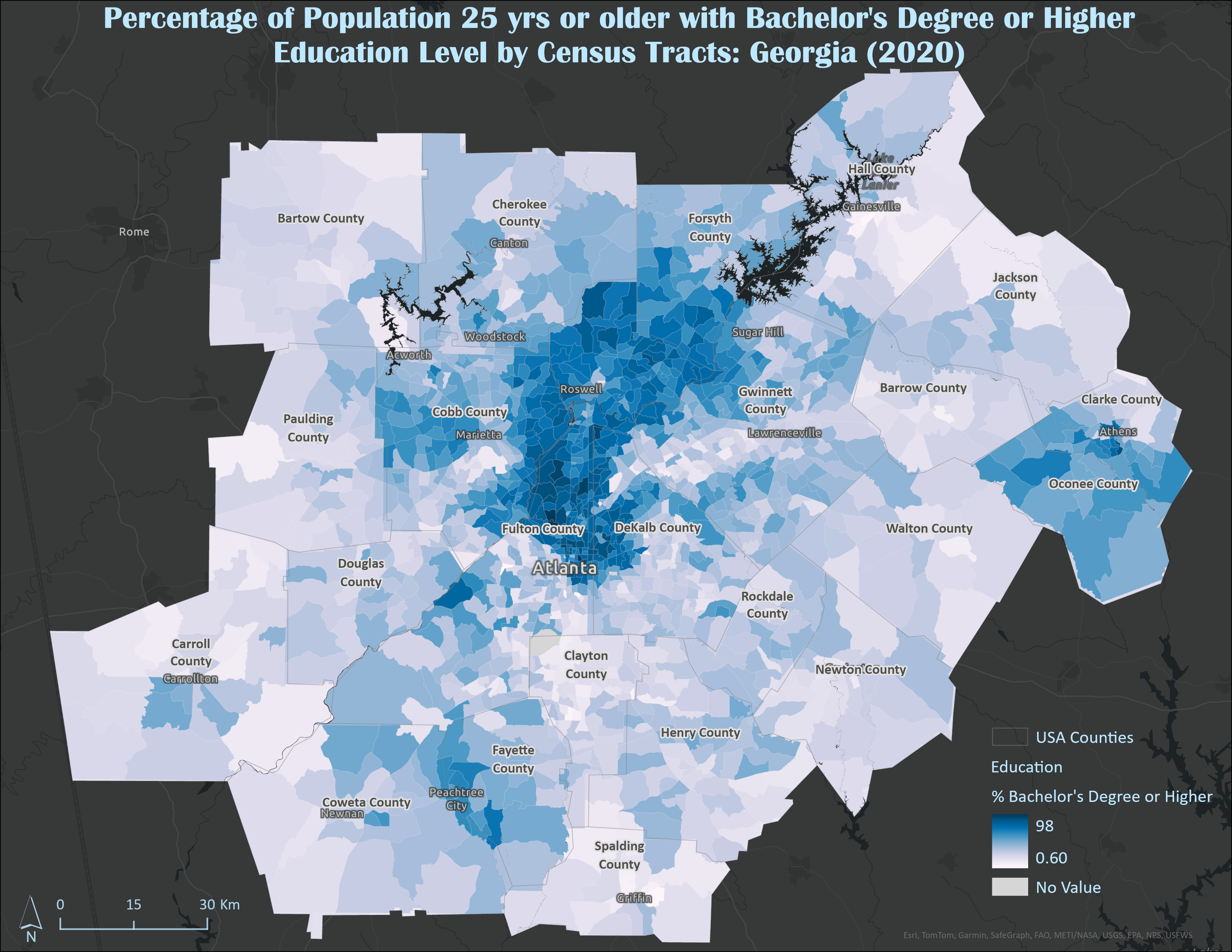
Census data provides detailed information about population, demographics, and socioeconomic factors. Choropleth maps use color shading to visualize these data across geographic areas, making patterns and trends easy to interpret.
This map analyzes census tract-level data from the state of Georgia, with a focus on counties surrounding Atlanta where notable trends emerge in population density, median income, and education levels. Using choropleth maps, the visualization effectively highlights geographic disparities and reveals a clear pattern: densely populated areas tend to exhibit higher median incomes and a greater proportion of residents with at least a bachelor’s degree. These findings suggest a strong link between urban density, educational levels, and economic opportunity. This trend is particularly pronounced in the Atlanta metropolitan area, where urbanization has led to significant economic growth, expanded access to higher education institutions and employment opportunities.
All data used in this analysis is sourced from the American Community Survey (ACS) and made available through the Esri Online Library.